
Hello everyone,
and welcome to a new episode of award winning series called
Housekeeping
That’s right! Another fast paced banger of an episode is waiting for us to fall asleep to after 2 minutes.
Seriously though, it’s been a while that we’ve had one of these housekeeping episodes. Which really are more like “What’s new” episodes.
I’ve actually silently rolled out a bunch of smaller and bigger changes over summer.
So today, I want to go over them real quick and give them a proper introduction.
Ready? Then let’s go!
Let’s start with the most annoying bit first.
Pronunciation Feature on iOS and iPhone – Progress (but still fail)
The pronunciation tool has not been working for many of you who are using iPhone or some other Apple device. The main culprit here is Apple, which doesn’t exactly care about making it easy for developers, but anywho… after quite some dabbling and the much appreciated testing help of one of you, I have managed to get to a point where the recording actually works on iPhone. So you can record yourself and playback your voice.
However, the AI that grades the pronunciation (which is provided by EF Languages) still gives a 0% score back. That means, there’s still something wrong. Nerd warning: Most likely with the MIME type and the base64 audio blob.
The problem now is that it’s really really really hard for me to troubleshoot this, as it means a LOT of trial and error and reading debugging outputs, which I can’t really do directly as I don’t have any Apple devices.
If there’s an developper among you who has experience with web front end and the MediaElement library, please reach out.
I would love to get this to work, but I can’t make any promises.
Anyway, on to more successful ventures.
New and shiny Pdfs
About a year ago, I announced that I want to upgrade the pdfs because they looked like crap.
Together with a volunteer (Thanks Emma!!), I started doing the editing and formatting by hand, but it was super slow and after one year, we only had 200 done. Which is about 25%. So yeah… too slow.
The amazing news is that I now have found a tool that generates them automatically, while at the same time giving me lots of settings for formatting.
So today, I deleted all the old auto generated pdfs and only left the ones up that we made by hand. And for all the rest, the new tool has you covered now. The button is the same as usual, so it’ll look like this:
The only difference is that the pdf will now be downloaded to your device instead of being opened. Let me know if you want me to change that back.
The new pdfs are not perfect, but they’re a HUGE step forward from the old ones and I now don’t feel like I have this HUGE backlog of pdfs I have to edit, which is awesome!
Oh, and also, the new ones are created “on the fly”, so you always get the newest version of an article.
Cool.
Next!
Dictionary – Relevant Article(s) Display
This feature has already been out for a while, but it’s also easy to miss, and it’s potentially quite useful.
One feature of my dictionary (you can reach it via the site search) is that you can see if I have talked about a word in an article in detail and get a link.
Originally, you could only see this in the detailed view of an entry.
But now I have added this information to the search results page. So you can see straight away if I have talked about a word in detail and you have the link right there, if you want to dig in.
Here’s how it looks now:
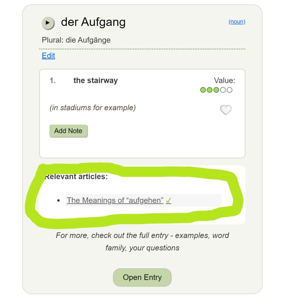
If the word is mentioned in multiple articles, you’ll find all of them linked here, and if there’s no article about it, you also know right away, so you don’t have to open the entry anymore.
Unless of course you want to check out examples, the family relations or ask me something in the comments :).
All right.
And now let’s get to maybe the biggest news.
New Toolbar and Settings
I have completely redone the “tools” that are available for an article.
You’re now probably like “Wait, what do you mean tools.”
What I mean are the following things:
- taking notes
- writing a comment while reading the article
- adjusting playback speed
- blurring examples
Note taking: this is a premium feature that allows you to take your own notes while reading an article and save them to your note archive. You can then just review the notes, if you want to and you can also download and print them. This feature is not new so you’re probably familiar with it.
Writing comment: this is available to everyone and it allows you to write a comment while you’re reading the article. You can open and close the comment window and type and it’ll keep whatever is already there until you actually post the comment.
This feature is also not new, but I can imagine that many of you kind of didn’t know what it’s for. It’s basically a way to write or post a comment without having to scroll.
Adjusting playback speed: This is also not a new feature but it was really easy to miss/ignore. You can adjust the playback speed for ALL audio (including your own recordings). It’s a time stretch supplied by the browser, so it’s not the best quality, but something like 0.7 times speed sounds fairly good still, so this may help with some of the examples. Until now, the feature was in the bottom right corner, but from now on, it is in the settings-section (which we’ll get to soon).
Blurring Examples: This is a new feature which I have added this summer based on your suggestions. It allows you to blurr out German or English or both languages for all the examples in one article and then unblur them on a case by case basis by just clicking on the blurry example. That way, you can practice listening (you blur both) or translating (you blur German) or reading comprehension (you blur English).
For a while, these settings were right under the headline of an article but now they have their proper place in the settings menu. Which we’ll get to now :)
So far, the buttons to access notes and comment were some more or less dubious icons next to the article or in the footer (on mobile).
Here’s how the buttons look now:
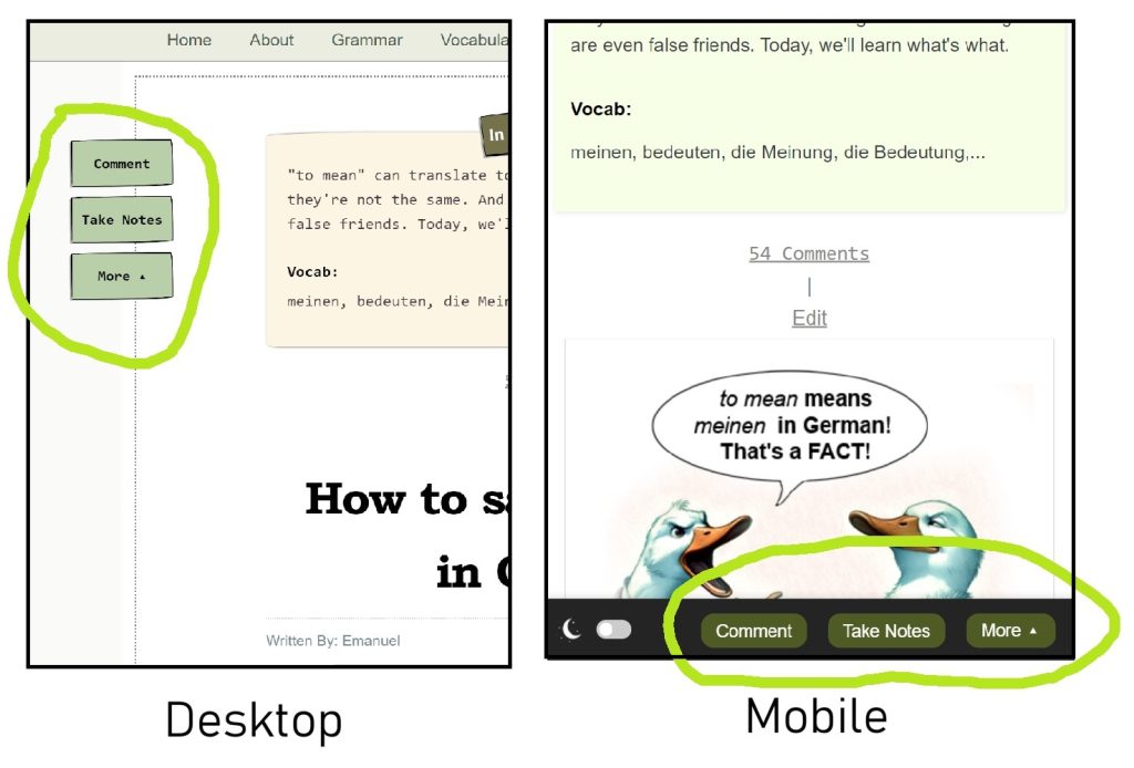
And when you click “more”, you’ll open the settings menu where you’ll find playback speed and the blurring options for the examples.
Here’s how that looks:
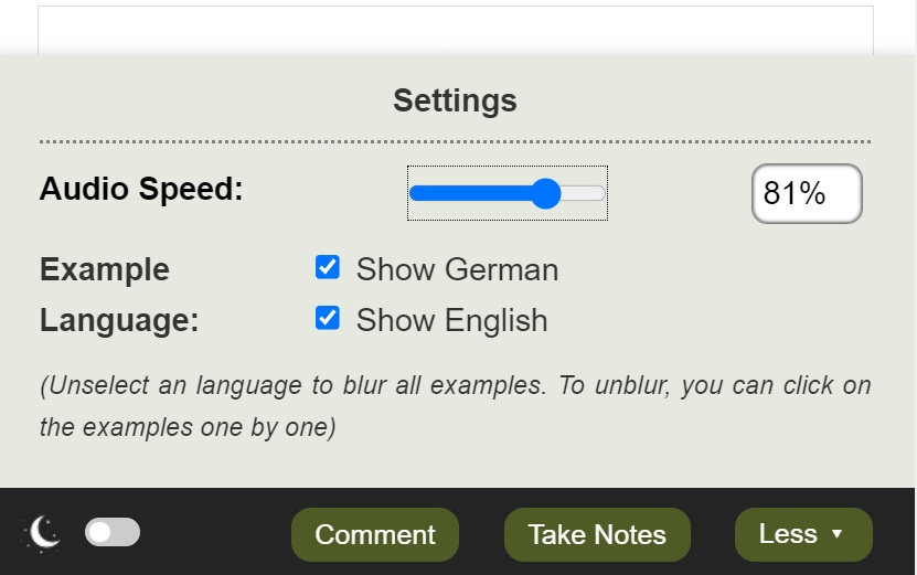
At the moment, these settings are NOT saved so they will go back to the default with every new article you open. Saving them does involve some cookie work, but if you want me to add that, please let me know.
So yeah… that’s pretty much it for today.
If you have any thoughts or suggestions or feedback about any of these features or any ideas about what else might be useful, please let me know in the comments. I really hope you like them and find them useful.
Have a great week and I’ll see you next time!
Oh and if you’re a developper with Apple experience and you want to help with the iPhone pronunciation feature issues, please let me know as well.

 Audio Speed
 Dark Mode
Ok, I am totally digging this comment area on the left. I have scrolled up and down many times. Bless you!
Great improvements! I really appreciate the relevant article option in the dictionary itself and the blurring/clear options.
One interesting note: My Mac Air has the bottom toolbar rather than the buttons on the left.
Thanks again for the great software work and even more the helpful, fun articles, and practice exercises.
“My Mac Air has the bottom toolbar rather than the buttons on the left.”
That’s based on how wide the screen is and how big the font, so at 1000px (I think) I set it to switch to bottom bar. I just put it on the side on desktop because on a really big screen, the bottom buttons are super easy to miss.
Nice update…aber
after recording a sentence and stopping in the normal way, I don’t hear a playback of what I said….
What device and what browser?
It’s not working on many Apple devices yet, and may not for some time.
I haven’t had time to read articles for aaaages and yesterday realised I had even let my membership lapse. But now I see there is a lifetime membership option, I’ll be saving up for that!
I love the new buttons and all these great updates. The links in the dictionary is a game-changer.
Nice work!
Hey Starbuck, someone (a reader) just sponsored a lifetime membership for you :)! Viel Spaß!
Hey off topic; your trick to catch flies using phone flashlight and glass has helped me a lot! Thanks!
For anyone interested in this super consistent method –
https://yourdailygerman.com/catching-flies-life-hack/
LOL, that’s awesome to hear :). Thanks for sharing and spreading the word.
I wasn’t quite sure from reading the article, but it looks like you can still click to blur a specific example. I love that option because it’s so quick and easy. And it works better than using a hand or putting on the ol’ safety squints :)
Yes, that still works. It has to, so you can unblur the examples :). But you can use the settings button to blur the language for ALL examples on one page at once and then unblur them as you go.
Nice job. Very user friendly.
Hallo,
I really like the way you made the buttons more accessible and the dictionary entries with the articles are a big improvement :))
I found a few typos:
developers (just one p); an developper among you (a developer among you)
troubleshoot (just one word)
the new one are created (the new ones are created)
If you have any thoughts or suggestion or feedback about any of these feature or any ideas what else might be useful (If you have any thoughts, suggestions or feedback about any of these features, or any ideas about what else might be useful)
I appreciate your work, all this programming stuff for interfaces can’t be easy, I’m sure most of us (myself included) don’t really realise how much work it takes to build these features…
Bis bald!
I’ve definitely gotten better at it over the years with this stuff, that’s why I can keep adding. Still, I’m not doing as much as I’d like.
And that Apple audio issue is BY FAR the worst and has taken the most time and it’s not even solved :). I. Hate. Apple!
Love having the comment button available without scrolling all the way down.
This request could probably be posted somewhere else, but: right now in Dark/Night mode, the background of comments is still white, but the text is a fairly light gray. I can still read it, but on my unimpressive laptop screen, it’s not that easy. Could you make either the comment text or background dark? (I’d prefer a dark background to match the overall theme, but either way would work.)
Thanks!
Hmm, that’s weird.
Here’s how it looks on my computer:
Could you tell me what device and browser you’re using?
And if possible, could you email me a screenshot?
Will do. The actual comment box is great, looks just like your screenshot. It’s just the comments that have been posted already that are hard to read.
If anyone else has the same issue, please let me know here, including what browser.
So yours looks different than this? This is Firefox on Windows 11 (blerg), but Chrome looks the same. I’m procrastinating right now, so I checked Windows 10 and it’s the same.
I remember having the problem you mentioned a while back. That would have been when dark mode was still pretty new. But then I went back to light mode, so no clue what happened since then.
I’m slowly cleaning up darkmode, but the comment display has been “proper” for a while already. browser cache works in weird ways though.
It does indeed – it was obviously a cache issue, like you thought. Ctrl-F5 did the trick. Thanks!
Did you write an article about the series “Dark”? I think I saw it at one point but I can’t find it anywhere on the site I don’t even know if it’s real anymore
P. S. My notifications still don’t open android’s google chrome it’s soooo annoying
I had “Dark” in the title of an article as a joke, but I never wrote about it. I have actually not watched a single episode, not even a minute :)
Can’t help you with the notification, unless you can give me a console readout from the browser and the browser version.
The new toolbar looks perfect on mobile.Way to go!